Showing posts with label Peek-a-Boos. Show all posts

Monday, April 4, 2016

Three April Projects Using Three Different Paper Lines By: Renea Harrison

Hello, and welcome to my April Design Team Reveal!! This month I have 3 different projects that I created using 3 of the newest Blue Fern Studios Paper Lines; Courtship Lane, Timeless and Serendipity. I love creating in different styles and I hope that you are inspired to try out one of the new paper collections and make it your own!!

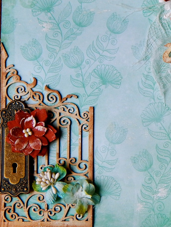
I love creating beautiful pieces with hints of grunge and shabbiness and the new Blue Fern Courtship Lane Collection along with the April Sketch was perfect for pulling this look off
for this first layout:


I started with a layer of Courtship Lane Royal Street Paper and then added a 2nd layer of Courtship Lane Royal Street Paper that I heavily distressed and inked. 


I added a layer of Timeless Lace for softness, 


 then took a Ruth's Doily Chipboard piece, painted it with gesso and script stamped it with clear embossing ink, coated it with Imagine Ink Ebony Embossing Powder tapped off the excess and heat set it to get a gorgeous raised script to match my book theme.


For the floral layer, I added a large fabric flower, and then layered in some of the new Blue Fern Courtship Lane Roses, some mulberry paper leaves, feathers and a resin swirl.


I then did some tearing at the top of my layout and took a Blue Fern Chipboard Peek A Boo, gave it the same technique treatment as the Doily, tucked it behind the tear and then sewed up the tear with some embroidery thread and tied a bow.
I added drips and splatters of gesso and glitter glass randomly to my layout for lots of visual interest.


I added some more of the Courtship Lane Roses, leaves and feathers to the top corner of the photo,


and added a Silver Pocket Watch that I filled with different beads and Glitter Glass for some really YUMMY Texture.


To finish up my layout, I took a Blue Fern Serendipity 1 Word-Contemplation and heat embossed it with the Ebony Embossing Powder, and then added on a set of my handcrafted Sweet Dreams Lavender Butterflies.

Blue Fern Studios Supply List:
Paper:
Courtship Lane-Plaza
Courtship Lane-Royal Street

Chipboard:
Ruth's Doily
Peek A Boo
Serendipity Words 1 (Contemplation)

Flowers:
Courtship Roses

Imagine Ink:
Ebony

I just love the new Blue Fern Studios Serendipity Collection!! The papers are perfect for my "edgy" meets beautiful style, and provided the perfect venue for me to create this natural, grungy pocket journal:


I started with a pocket journal base that I sew together using upcycled manilla folders. I then layered on a piece of the Blue Fern Serendipity Glee Paper that I cut to fit my design


I cut a strip of canvas and 2 tone spray stained it and then threaded a metal safety pin into the top of it, added a little bird cabochon to match my theme and adhered the piece down the side of the journal.
I took some Blue Fern Chicken Wire Panel Chipboard pieces that I cut out from the panel, and gave them a "rusty" look by heat embossing them with Imagine Ink Nutmeg Embossing Powder, and tucked them into my design.


Next, came a piece of torn, 2 tone spray stained, corrugated board, topped with spray stained cheesecloth, and different flowers and little bird's nest.


I then took a Blue Fern Frill Heart Chipboard Piece, and I heat embossed the edges with Imagine Ink Peacock Embossing Powder. For the center I coated it with Shard Glitter Glass and then shot it with some of the spray stain that I used on the other pieces. I then created a little, multiple layer heart with leftover Serendipity Paper Pieces, and added a little flower.


I added another spray stained piece of canvas and cut out the word "Beauty" from the Serendipity Calling Cards Paper, and added it to it. The Chasing Butterflies are some of my handcrafted Butterflies that I love to add to my projects for added dimension.


The pockets of the Journal Base contain tags and pieces that I created from the Blue Fern Serendipity Glee, Imagination, and Calling Cards Papers. They include:
2 Oversized Tags topped with hand dyed seam binding bows and cabochons
2-Large tags topped with spray stained canvas pieces
2 - Calling Card Pieces that open up book style
and 


this large piece that I created by taking a Blue Fern Swan Gate Chipboard Piece, and lining it with Serendipity Paper to create a tag. I added a Dream Metal Key and hand dyed seam binding hanger. 


To get the rusted look on the gate, I first heat embossed it with Imagine Ink Peacock Embossing Powder, and then randomly dabbed it with clear embossing ink and sprinkled those spots with Imagine Ink Nutmeg Embossing Powder to get that YUMMY, aged look.


Here is the back side of the jounal that was finished out in Serendipity Imagination Paper.

Blue Fern Studios Supply List:
Paper:
Serendipity-Imagination
Serendipity-Glee
Serendipity-Calling Cards

Chipboard:
Chicken Wire Panel
Frilly Hearts
Swan Gate

Imagine Ink:
Embossing Powder-Peacock
Embossing Powder Nutmeg


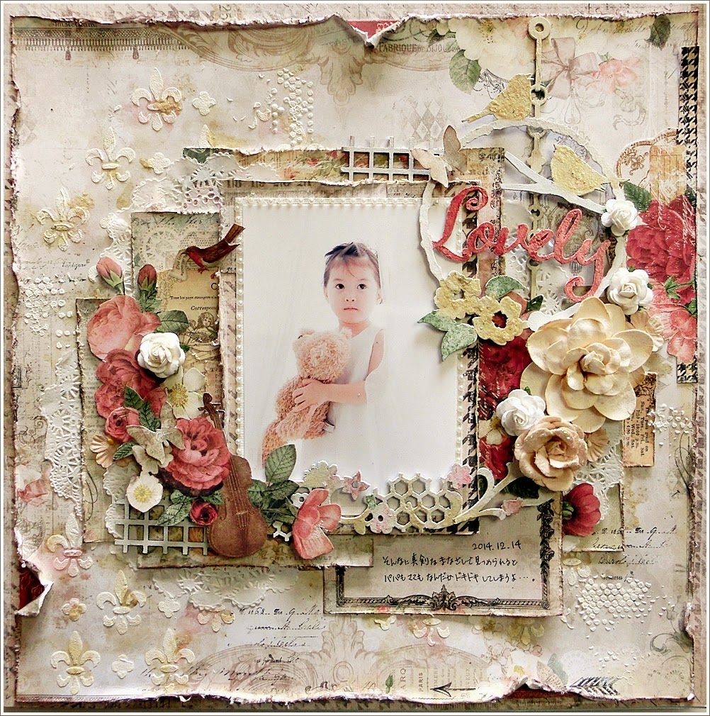
And for my 3rd and final project, the Blue Fern Studios Timeless Collection with it's grungy, darker more Vintage look papers inspired me to create the following masculine layout of my son, Draven. I just used the papers in a way that omitted or covered up the more feminine floral designs to leave me with designs that worked perfectly for that no flower, all edginess of masculinity.


I started with a a layer of Timeless Main Street Paper, and then tore and layered in corrugated board pieces that I two tone misted and Timeless Papillons and Artistique Papers.


I did some edge curling on some of the paper and then inked them to match the corrugated board colors.


Next, I added in Blue Fern Roman Clock Chipboard (small).


I then took some Blue Fern Cogs And Gears Chipboard pieces, and heat embossed them with Imagine Ink Honey and Ebony Embossing Powders, and layered them onto the clock pieces.


I also used Blue Fern Frolic Mesh Chipboard that I cut into pieces and colored with a distress marker and tucked into random places throughout the layout. I added various metal pieces to round out the finishing touches for the layout. 


Here you can see all the dimension and textures that the layers of papers and chipboard created.

I know a lot of you tell me that masculine work is a real challenge for you, but the Blue Fern papers and quality chipboard really do make it easy to pull a gorgeous masculine piece off!! Thank you so much for checking out my April work, and I hope you have fun creating!! Hugs~Renea

Blue Fern Studios Supply List:
Paper:
Timeless-Papillons
Timeless-Main Street
Timeless-Artistique

Chipboard:
Roman Clocks Small
Cogs & Gears
Frolic Mesh

Imagine Ink:
Embossing Powder-Honey
Embossing Powder-Ebony


Thursday, March 3, 2016

March Inspiration with Jelissa

Hello everyone, March is here!

I cannot believe how quickly time passes seeing that we have only just celebrated our Lunar New Year here with lots of festivities, feasting and family gatherings. Today I'm up on the blog again to share two creations using two fabulous collections - Serendipity and Courtship Lane.

My first share is created with Serendipity. This is a truly amazing collection with all the lovely subtle details nested amongst darker shades. I find myself reluctant to do my usual kind of background work because I couldn't bear to cover up the details.

Because there is so much details on the pages, I can only imagine the number of photoshop layers that went into creating each piece of patterned paper. With that in mind, I did had several overlapping layers of patterned paper as my background to bring out the depth of this collection.

Details in the close-ups:


Heat embossing with Oatmeal EP. I wanted something dual-tone and subtle enough to blend into the background, so I used half-toned stamps to create the motifs.


Love these peekaboo chippies! They are just perfect for these sort of little nook and cranny. I used Garnet EP as my base, and while the melted powder is still hot, I sprinkled Ginger EP on top. The gold is really quite amazing!


My title piece which I had colored with gelato and sealed with a layer of Pearl EP.


Layering Stems which I first covered with Lime Ep, then with Ginger EP because I think I'm addicted to the lovely gold it gives. 

Blue Fern Studios products used:

paper: Serendipity - Calling Cards, Imagination, Contemplation
chipboard: Peek-a-boos, Layering Stems, Laughter Happy Smile


My next share is a video tutorial done with the gorgeous Courtship Lane collection. I'm really loving the color palettes that Michelle has used and pastels always speaks to me. 


I'm a sucker for wood grain motif so it was no surprise that I had to use Bourbon Avenue as my background. This is a photo of my second boy and my youngest girl - she looks exactly like him when he was just a baby. This moment was one in a million - my boys love to make a pouting funny face and I was only trying to capture the two of them looking at me. Never did I expect this cheeky girl to do the same without prompting - we all know how hard it is to get them to even look at the camera, let alone pose! - and I instinctively just froze this memory in time.

More details in the close-ups:


Berry stems layering over Shabby Brick bits with lots of textural detail in the background.


Clusters of embellishments


Painting directly over chipboard and paper for a nicely blended effect.


Fussy cut details everywhere.

And here is the start-to-finish video:

Blue Fern Studios products used:

paper: Courtship Lane - Bourbon Avenue, Town Gossip,
chipboard - Berry Stems, Shabby Brick Bits, Whimsy Flourish
embossing powder: Pearl, Iris, Lilac
stamps: Garden Frolic, Arcadia Textures

Tuesday, June 23, 2015

Introductions! Sandi Clarkson mixes it up!


Hello, Blue Fern Studios fans! My name is Sandi Clarkson and I am new to the Blue Fern Design Team ... although very familiar with the product. Having worked with the Blue Fern Studios owner, staff and many of my fellow team members, I almost feel like I've come back home! It doesn't hurt that I live in the same state where Blue Fern is manufactured to strengthen that sense of belonging! (Texas, USA) 

I'm married with three grown, married daughters and a growing number of grandkids! I still work 3 days a week and so I truly enjoy getting "lost" in creating! I like trying new techniques but am usually happiest when the results still fit my "pretty" criteria. My scrap room is my happy place. I kind of love that my desks have paint, gesso and runaway micro beads all over them. I'm mostly a layout girl but love, love, love doing the occasional canvas. 


Now, on to my first three Blue Fern projects! 

"Authentic Treasure"

I have the distinct pleasure of being one of the first DT members to receive the new Paisley & Vine paper collection! This collection was introduced here on the Blog on June 10th.  I wish my photos could truly capture how lovely this range is, with lots of great warm colors and fun patterns. Although it is a bit of a departure from the classic Blue Fern style, it is earthy and rich and will be a great addition.  My mind is racing with the possibilities! 

I decided to go "shabby" with my photos and chipboard choices but chose some bold paper patterns,  Splendor  and Bohemian, and layered them against a lovely turquoise background, Pathway. I love this color combo! 


I also fussy cut some title notes from the Playing Cards sheet and distress them a bit with my distress tool and some white paint. You can see bits of my chipboard pieces that are a little higher on the page. 


My photos were framed with the Royal Heart Frame which was gesso-ed and inked, as was my Dashwood Bouquet piece. I embossed the tips of my Dashwood Bouquet for a bit of glimmer. Photo credits go to Raphael Tuck and Sons but are from a copyright free database. 


The Royal Gate chipboard pieces was used to balance my layout and was treated similarly to the Royal Heart Frame. A few embellishments and it was done! 

Blue Fern Studios products used:
Paper:
Paisley & Vine Pathway 
Paisley & Vine Splendor
Paisley & Vine Bohemian
Paisley & Vine Playing Cards

Chipboard:
Royal Heart Frame
Royal Gate
Dashwood Bouquet

***

"Good Vibes" 

Once in a while I really love to let loose and go a little Boho/Steampunk as I call it. I had not had a chance yet to use side B of the Love Story Amazing Hearts paper. The colors and collage appearance are so totally "me!" I've also been dying to get my hands on those BFS Goggles! The Steampunk photo from Tumblr just brought it all together. 

Here are some close-ups:


After gesso-ing the goggles, I applied chalk ink and paints in different colors, adding a little metallic Patina from a tube. I've used Embossing powder on the inner rim and then painted the magnifiers black so that they would stand out. I've paired them with the Notebook edges which were treated with chalk inks and some random paint. Love Story Calling Cards made for a perfect photo mat. There is also some Journey stamping to the left with the Journey stamp. 


Here you can see the Graduated Circles which I've used to frame the photo. They were treated the same as the Notebook edges. My Good Vibes title is from the Good Vibes word set. You can also see a bit of the Journey stamping here on the right which helps create depth. 


The Cogs and Gears were treated the same. Love the Industrial look they bring. 


Of course, I finished off with florals, metal and Flair. 

Blue Fern Studios products used:
Paper:
Love Story Amazing Hearts paper
Love Story Calling Cards paper

Chipboard:
Goggles 
Cogs and Gears 
Graduated Circles 
Notebook Edges
Good vibes word set

Stamps:
Journey Stamp

***

"Delightful"

I don't know about you but I've been on a purple kick lately along with a vintage photo binge! And so, the colors of the Deja Vu collection really called out to me. Here I've paired the collection with some sweet vintage photos, chipboard and purple and cream florals. 


The new Quatrefoil Frame made a fantastic photo mat here. It was simply gesso-ed with white. 


The Flutter Medley is also a newish piece and made for a great border at the bottom of my photos. I've used chalk ink to give it a tiny bit of color. The Delightful title is from the Optimist Word Set and was painted white, then off-set to provide balance. 


I'm in love with the new Peek-a-boos and used one at the top of my project. This photo also nicely demonstrates the use of the Halftone Stamp. 


Lots of fun dimension and texture! 

Blue Fern Studios products used:
Paper:
Déjà Vu Un Voyage a Paris paper
Déjà Vu La Plume paper
Déjà Vu Tresors paper

Chipboard:
Quatrefoil Frame
Peek-a-Boos
Flutter Medley
The Optimist Word Set

Stamps:
Halftone Stamp


Okay, that's it from me this month! 
I look forward to being with you in July.
Be sure to visit the "Where to Buy Blue Fern Studios" page for information on finding vendors. 

Sandi

Saturday, May 9, 2015

New from Blue Fern Studios!

Welcome to the weekend!  Hopefully you have something fun planned.  Today we would like to show off the new chipboard pieces and sets we have added this week.

Victorian Corner


Aloha Flowers


Quatrefoil Frame


Novelty Trims


Radiant Bursts


Flutter Medley


Chipper Frame


Peek-a-Boos


These Peek-a-Boos are something new that designer Michele Singh recently came up with.  What are they for, you ask?  You know those times when you tear back a little bit of your paper (like Yuko has done in a couple of places on her layout below)?  Imagine tucking in one of these beautiful chipboard pieces so it "peeks out".  Love that idea!  And we're sure you will find lots of other ways to use these new pieces.


So, tell us what you think.  We love to receive comments from you.  Which are your favorites?